An Exercise in Frustration Online

When I’m not writing this blog, I spend a lot of my time at work. For a living, I manage digital products, specifically web applications, for a well-known and respected brand. And, if I’m being honest, I’ve been using and making for the web for the better part of half of my existence on this earth! All of this is to say, I know a thing or two when it comes to what works, and what doesn’t.

I’d like to share a story about an experience that didn’t work so well for me and how I’d recommend fixing it.

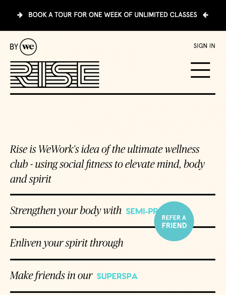
Ever since I moved, I’ve been thinking about switching up my gym routine. The other day, I was scrolling through Instagram (as one does) and saw something about Rise By We. Based on the post, it looked like they had a boxing or kickboxing program which I’d be really into since I’ve been doing Muay Thai for years now. Intrigued and because they mentioned something about a free intro class, I clicked on the link from my phone to arrive at RiseByWe.com.

The homepage set an odd tone. The “Refer a Friend” button is more prominent than I’d expect — it blocks the marketing copy that someone went to great efforts to write. Meanwhile, that copy is changing at an interval (in the screenshot below, the blue words are constantly changing so as I’m trying to make sense of what’s behind that button, it goes away.

Refer a Friend? But I don't even know if I actually like you yet!
Refer a Friend? But I don’t even know if I actually like you yet!

I can get around this, it’s just some marketing, but I’m curious — where is this place? In essence, realistically, does this gym work with my getting to work/home routines? I decide to check out the navigation menu (the delectably named “hamburger” menu for all you insiders) to see where it’s located. Continue reading “An Exercise in Frustration Online”

Houzz: Mobile isn’t always Better

Now that we have a house, I feel like I can finally utilize all the core competencies I’ve been building watching approximately a bajillion hours of HGTV. Of course, on TV every contractor is lithe, attractive and looking out for your best interest. In reality, it’s more like you are lucky if they aren’t weird and/or shafting you.

Hearing about so many horror stories, I was really happy to discover apps that can help with sourcing and vetting vendors. One of those is Houzz, but their mobile app leaves a lot to be desired. In fact, I believe some features are buried and perhaps it’s because the organization is not ready to invest in their success. Continue reading “Houzz: Mobile isn’t always Better”

Dark Patterns

Sometimes things happen and they are just coincidence and sometimes things happen, especially on the internet, and someone explicitly went out of their way to make that happen. You may find this when you are casually browsing a retail site for a pair of shoes and then, through the magic of something called “retargeting,” you keep seeing advertisements for that same pair of shoes. At this point, we all see this coming so it doesn’t come as a surprise.

Everyone is tracking us everywhere — and sometimes we willingly let them track us by volunteering information about ourselves (i.e. what we all do on Facebook day in and day out). This is okay as long as everyone’s complicit; when the product you are using is free, YOU are the product (the selling of information about you to target selling you stuff, in essence).

What I find far more disturbing is a trend toward dark patterns that I’m seeing in the design of products. I define a dark pattern as a product that takes you somewhere that you as a user don’t want to go. It’s intentionally leading you to something you may not want — usually the end game is to lead you to something that is profitable for the product but not so great for the consumer.

Dark Bouquet by Jen Gallardo

Continue reading “Dark Patterns”

Let’s Just Start Over or: How I Learned to Stop Worrying About the Product and Comfort a Cranky Stakeholder

I wrote this piece on Medium first about my work as a Product Manager:

Last week, colleague walked over to my desk to ask me about the product I just started working on. And by started to work on, I mean I inherited this product in part because there was some significant “clean-up” needed and rumor has it that I’m good with fixer-uppers. His question to me was, “How about we just start over?” In short, stating that he’d almost rather walk away from this dumpster-fire mess than somehow try to put out the embers and make something of the leftover half-burned pieces of fresh garbage. Well, this isn’t exactly what he meant but that’s probably how I felt when I heard the question and realized the hole I now needed to climb out of.

Bonfire at Night
Bonfire #8 by Jen Gallardo

Continue reading “Let’s Just Start Over or: How I Learned to Stop Worrying About the Product and Comfort a Cranky Stakeholder”

In Defense of Cold Feet

Right now the temperature is starting to warm up in New York. However, it’s inevitable: winter will be here again before we know it.

Ned Stark in Game of Thrones
#winteriscoming

And every winter, I’m freezing to death because at some point in time I wore the wrong shoes. Like that time I was going to Philadelphia and needed a headphone splitter so my husband and I could co-watch a movie on the bus ride down. I spent the better part of an hour searching for one while the snow came down around me. All I found was that my boots had sprung a leak and that apparently the only place to buy dry socks in TriBeCa is at the Equinox where you will spend too much money for them (do rich people not need socks?!).

Continue reading “In Defense of Cold Feet”

I Die Every Time I Hear “The Fold”

I’ve worked at a lot of different companies, both big and small, and one thing that has been consistent is how people think about laying out content on the web. Most people think about the canvas as a static Photoshop document. A lot of people still think about design as purely existing between a Desktop computer and a user (more on that in a sec!) and then there’s the dreaded “fold.”

We’ve come a long way…but some things just don’t go away. And I can’t tell you how many times I’ve been disappointed when someone asks “where’s the fold on this page?” Did I say disappointed? I actually meant I die a little bit on the inside.

As you can probably tell, I feel a bit strongly about eliminating “the fold” from the vernacular when we talk about web design. There are three key reasons for this:

1. The term is for print, not for web

As far as I can tell, this is a holdover from the print world. In newspapers, there is indeed a fold where the paper is literally folded in half. Arguably, a front-page story that’s below the fold doesn’t quite have the same splash as the one at the top of the page (above the fold). Pretty logical for print and, in fact, there are numerous other industries that have a similar concept. For example, in film and television production, there’s an idea of being “title safe” where there’s a certain amount of space around the edges of your frame where you don’t put text that you want to ensure people will be able to see.

There are numerous studies (including this one from Nielsen) that indicate people will indeed scroll. There are products (like Pinterest) that depend on people’s propensity to scroll. People scroll! People scroll when they are immersed in something; sometimes we are browsing whereas sometimes we want to get to the point quickly because we are more task oriented.

2. The fold is what you make it

If you really want to think about “the fold,” then at least let your users tell you where it is. I find so many folks assuming the fold will be at around X hundreds of pixels but the only way to really know for sure is to dive into your analytics package and pull some cold hard data.

More likely than not, looking at browser heights across your users will give you some insights. It’s likely that, unless your site is particularly unusable at certain breakpoints, you’ll have a distribution that is not unlike the rest of the internet. Additionally, to some degree you have to understand your content hierarchy and how that’s making your users feel. More data, like bounce rate, time spent on site or even percentage of the page the user scrolled through before abandoning, can tell you a lot about how your content may not be helping your cause. Again, people will scroll and they will scroll because they want more of what you are giving them; if you aren’t giving them what they want, they will bounce (and you’ll see that data in your bounce rate and exits).

If you really want to think about a fold, you have to realize that it is a range. It’s not just 600 pixels. It will depend on your users and largely what device they are browsing on, which brings me to the next point…

3. Three words: responsive. web. design.

Responsive web design flipped the script! We want to respond to the device the user is on and the breakpoint at which they are navigating to our experience. If the user is on a mobile device, chances are we don’t want to load giant images that will make the page take forever to load. Making adjustments to respond to the user where they are will require significant re-thinking of design and layout.

However, what this doesn’t mean is that you have distinct versions of everything across a million breakpoints. You really have to be measured about how you display the content, especially on smaller devices. There are tactics you can employ to make it a great experience in a smaller viewport without cramming everything into the top of the page because you don’t want to fall below this ficticious fold.

What’s clear is that you have to be rather ruthless when it comes to content hierarchy. What is absolutely the most important thing you need to see immediately? And then, how do we design the UX in a way to draw someone into exploring more of that content if it’s not readily available on page load. In my opinion, this often means we have to be a little more concise which I know is something few folks who create content and manage content want to hear.

To make a long story short, don’t be that person who talks about “the fold.” There’s definitely an argument to be had about content hierarchy and how you organize content most effectively to drive users into a given behavior and/or give them what they want right away but that shouldn’t come at the sacrifice of the integrity of your user experience.