Sometimes things happen and they are just coincidence and sometimes things happen, especially on the internet, and someone explicitly went out of their way to make that happen. You may find this when you are casually browsing a retail site for a pair of shoes and then, through the magic of something called “retargeting,” you keep seeing advertisements for that same pair of shoes. At this point, we all see this coming so it doesn’t come as a surprise.
Everyone is tracking us everywhere — and sometimes we willingly let them track us by volunteering information about ourselves (i.e. what we all do on Facebook day in and day out). This is okay as long as everyone’s complicit; when the product you are using is free, YOU are the product (the selling of information about you to target selling you stuff, in essence).
What I find far more disturbing is a trend toward dark patterns that I’m seeing in the design of products. I define a dark pattern as a product that takes you somewhere that you as a user don’t want to go. It’s intentionally leading you to something you may not want — usually the end game is to lead you to something that is profitable for the product but not so great for the consumer.
I wrote this piece on Medium first about my work as a Product Manager:
I work in a large room that’s offset from a larger and more public area. The room is locked, so that only people who work for my company can enter as long as they have an ID badge with the appropriate permissions assigned. There are two doors through which one can enter the room. These doors can be opened by anyone from the inside of the room, but you must first push a red button adjacent to the door.
Inc Magazine published an amazing piece by Jen Alsever in 2014 outlining how companies should market tech to women. In short: Houston, we have a pink problem!
I have no idea where this came from but there appears to be some prevailing logic among marketers (perhaps mostly the male decision makers? I digress…) that women will buy something as long as the item in question is pink. Perhaps the worst (and simultaneously best!) example of this is when BIC, the company that creates writing implements, decided to create “BIC for Her.” The marketing for this pen — which, by the way, was just like their other pens except pink on the outside — seemed to imply that women had been waiting eons and FINALLY the good folks at BIC created a pen for the ladies! Needless to say, Amazon reviewers have had a field day with this.
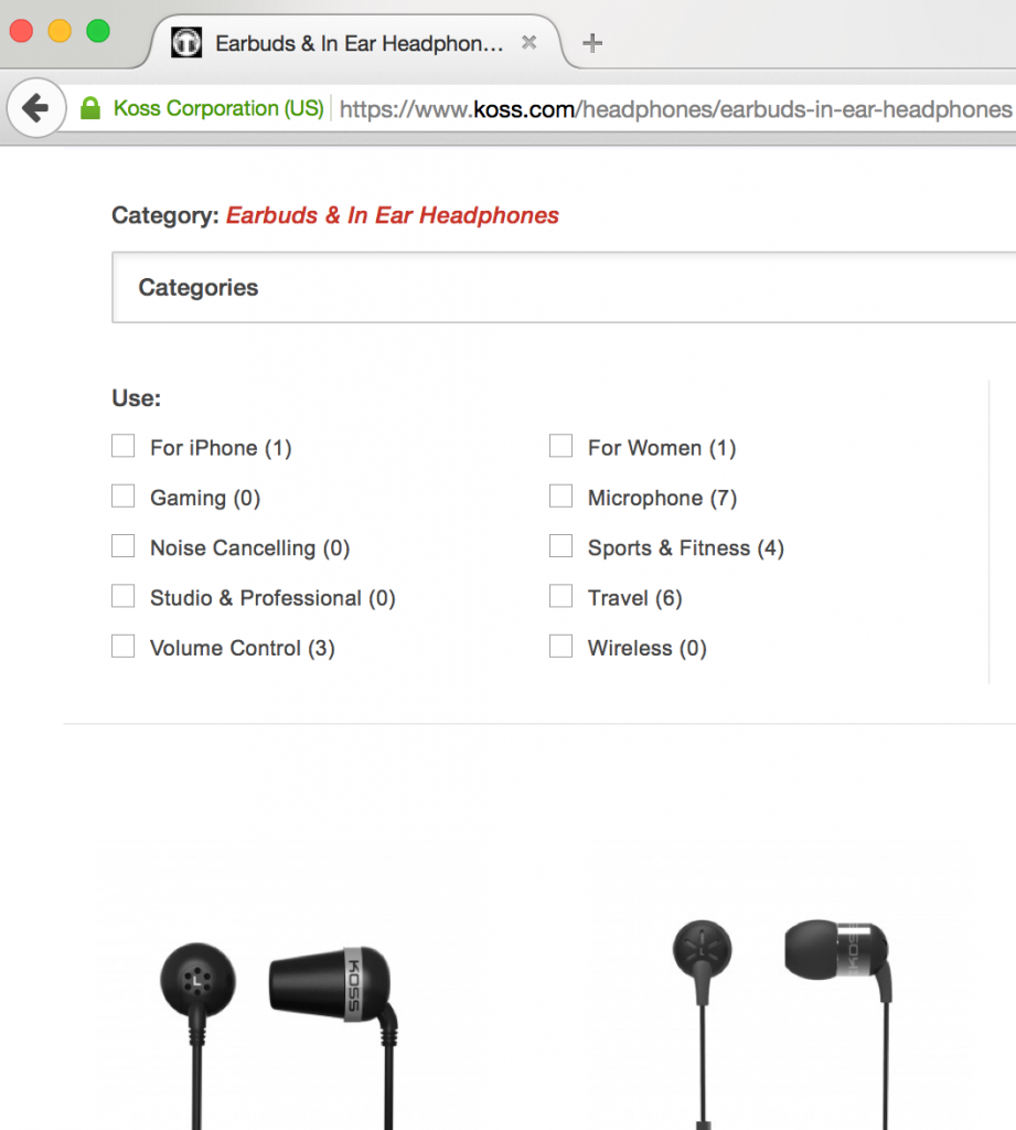
Today I discovered that KOSS, a brand that creates affordable headphones that I happen to really like, has a rather unfortunate filtering criteria on their shopping website.
Within the “earbuds” category, KOSS’ filtering criteria tells me that in the “For Women” category there is only one option. Who on earth decided that of the 20 earbuds listed on their shop, only one pair was appropriate for women? And furthermore, who decided that the “FitBuds” (which come in colors like Coral and Mint!) are exclusively for women? Do men not enjoy colorful earbuds? And, while I can acknowledge that maybe some women have smaller ears, surely having small ears / ear canals is not a problem exclusively faced by women. That said, I own earbuds from KOSS; the ones I own are not in the “For Women” category which begs the question: why even have a “For Women” category at all? How about filtering criteria based on scale (large buds / medium buds / small buds)? Or filtering criteria based on color (colorful / printed design / black)?
Not only is the KOSS approach lazy but it’s also insulting and demeaning to women. While brands probably do not intend for this to be the result, they are making assumptions about a market they are trying to reach. These assumptions are simply validating that they know very little about the market they are aiming for and have done very little to educate themselves. And I say it is lazy because, per Alsever’s second point in the Inc article, “women” is pretty broad as far as being a segment you are looking to target.
In the past, I came down on the Coach handbag company for this but it seems like their website has evolved! Their marketing used to infer that their beautiful leather totes and briefcases were only of interest to men. Their web shopping experience used to put all of these bags under the “Men” heading. Now, I’m happy to say that under “Women” they have a “Business Bag” category which includes many of the fine leather bags that are gender neutral. They also have a “For Everyone” header which is nice to see for gender identities that aren’t so black and white.
In short, I’ve reached out to KOSS on their Twitter account to implore them to fix their filtering. Given that I do really enjoy using their products, I hope they will consider making some efforts to avoid pink-washing their marketing.
The New York Yankees are well-known in the baseball world for having many many championships. While I’m a much bigger fan of the other baseball team in the city (the New York Mets), I still end up finding myself at Yankee Stadium often enough. Ah, the things we do for love!
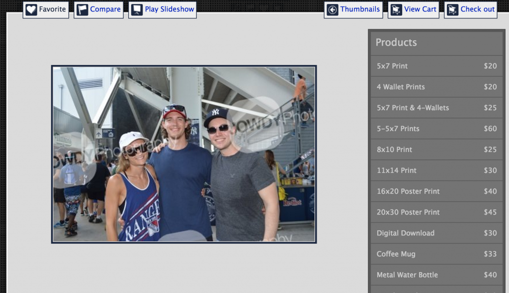
That said, on our most recent trip to Yankee Stadium we were approached by a young lady offering us the opportunity to take our photograph. This seems to happen a lot at most sports venues and, if you are with a large group, it’s nice to have someone else take a group shot — even if you do have to go retrieve it later and pay a boatload of money for it. Though the woman who took our photo was very nice, she handed us a poorly designed business card sized piece of paper for us to use in order to retrieve our photo.
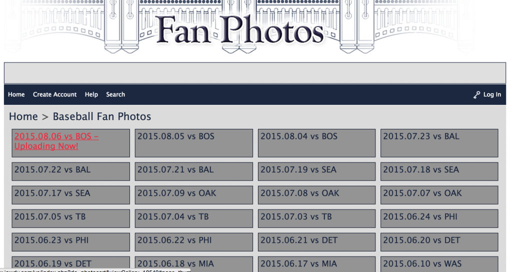
I’ve done this before but I was surprised to find that, of all the stadiums at which I’ve done this, the Yankees have the absolute worst fan photo user interface. Let me explain…
The business card instructs me to go to a specific website and that my photo code is XYZ (for example). When I arrive on the website, it isn’t immediately clear to me where my photo code comes into play. I click on “Baseball Fan Photos” instead of “Soccer Fan Photos” — that much is clear.
Which game did we go to again?
Then, once I’m in the baseball area, all I see are various dates of games. Again, it’s still not immediately clear where I’m supposed to enter my photo code. Also, I’ve had this card sitting at the bottom of my purse for a few weeks now — without going back to my calendar, it’s really hard for me to remember the date of the game I went to. However, that’s exactly the exercise the New York Yankees expect you to embark upon when selecting your photos.
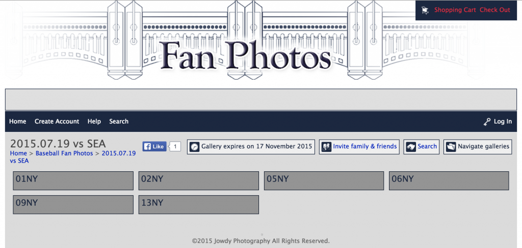
Now which of these cryptic folders should I open?
I went back to my calendar and found out when I went to the game. It was a Sunday in mid-July so I found it. At this point, it now shows me a list of numbers appended by “NY” — I see “09NY” and notice that this matches my photo code. Again, I still don’t have a way of entering my code and quickly retrieving the photos from this particular day.
Searching gets you nowhere…
Nonetheless, I decide to click on “09NY” and see what happens. At this point, over 300 pictures load in a thumbnail view. I’m still not clear on whether I can search but I do see a “Search” button so I click on that to see if maybe I can enter the rest of my photo code to get directly to our photo. Sadly, when I attempt to do that, all I get is a black overlay over the page, but no interface or anything appears via which I can search.
Given that I still can’t search, I decide that I’ll just browse. The one thing they did get right in this user interface is that they use lazy loading rather than having me click through 10 pages of content. I continue scrolling until I find my photo code number. Once I find it, I’m severely disappointed — the people in this photo are not me and my friends! Not even close to being us. And I have absolutely no way of finding the photo I was trying to find.
Who are these people?!
This UI is so severely broken and such a negative touchpoint for an organization that is such an established brand. The New York Yankees may want to consider partnering with a better vendor to do this work in order to maintain the kind of on-the-field dominance they exhibit in their off-the-field interactions with their fans.