An Exercise in Frustration Online

When I’m not writing this blog, I spend a lot of my time at work. For a living, I manage digital products, specifically web applications, for a well-known and respected brand. And, if I’m being honest, I’ve been using and making for the web for the better part of half of my existence on this earth! All of this is to say, I know a thing or two when it comes to what works, and what doesn’t.

I’d like to share a story about an experience that didn’t work so well for me and how I’d recommend fixing it.

Ever since I moved, I’ve been thinking about switching up my gym routine. The other day, I was scrolling through Instagram (as one does) and saw something about Rise By We. Based on the post, it looked like they had a boxing or kickboxing program which I’d be really into since I’ve been doing Muay Thai for years now. Intrigued and because they mentioned something about a free intro class, I clicked on the link from my phone to arrive at RiseByWe.com.

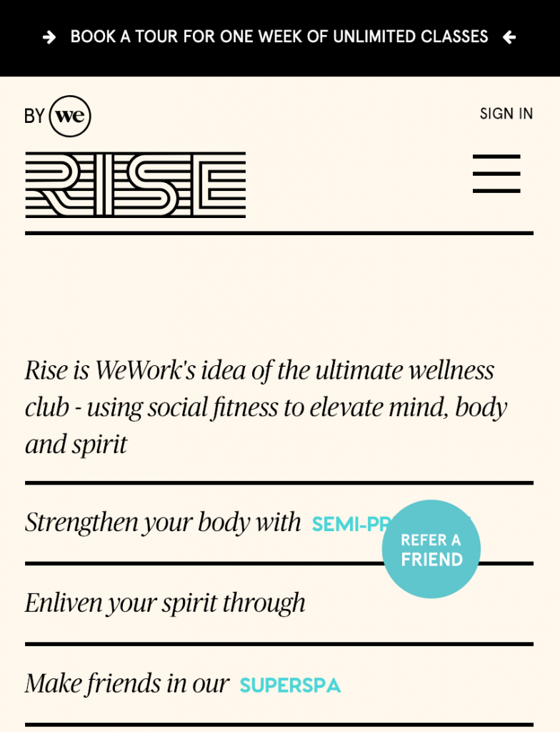
The homepage set an odd tone. The “Refer a Friend” button is more prominent than I’d expect — it blocks the marketing copy that someone went to great efforts to write. Meanwhile, that copy is changing at an interval (in the screenshot below, the blue words are constantly changing so as I’m trying to make sense of what’s behind that button, it goes away.

Refer a Friend? But I don't even know if I actually like you yet!
Refer a Friend? But I don’t even know if I actually like you yet!

I can get around this, it’s just some marketing, but I’m curious — where is this place? In essence, realistically, does this gym work with my getting to work/home routines? I decide to check out the navigation menu (the delectably named “hamburger” menu for all you insiders) to see where it’s located. Continue reading “An Exercise in Frustration Online”

Houzz: Mobile isn’t always Better

Now that we have a house, I feel like I can finally utilize all the core competencies I’ve been building watching approximately a bajillion hours of HGTV. Of course, on TV every contractor is lithe, attractive and looking out for your best interest. In reality, it’s more like you are lucky if they aren’t weird and/or shafting you.

Hearing about so many horror stories, I was really happy to discover apps that can help with sourcing and vetting vendors. One of those is Houzz, but their mobile app leaves a lot to be desired. In fact, I believe some features are buried and perhaps it’s because the organization is not ready to invest in their success. Continue reading “Houzz: Mobile isn’t always Better”

Another Perspective on Stuff You Fill Out

I was scrolling through Twitter today when a Tweet by someone I don’t follow about a topic I’m privileged not to be intimately familiar with happened to catch my eye:

I say I’m privileged because, while I joke about being blind because I’ve been wearing glasses since 2nd grade, I’m not actually impaired. I’ve never had to experience this wild and wonderful thing we call the internet without the gift of sight. And, throughout my career as a web developer, accessibility was often an after-thought.

Continue reading “Another Perspective on Stuff You Fill Out”

Dark Patterns

Sometimes things happen and they are just coincidence and sometimes things happen, especially on the internet, and someone explicitly went out of their way to make that happen. You may find this when you are casually browsing a retail site for a pair of shoes and then, through the magic of something called “retargeting,” you keep seeing advertisements for that same pair of shoes. At this point, we all see this coming so it doesn’t come as a surprise.

Everyone is tracking us everywhere — and sometimes we willingly let them track us by volunteering information about ourselves (i.e. what we all do on Facebook day in and day out). This is okay as long as everyone’s complicit; when the product you are using is free, YOU are the product (the selling of information about you to target selling you stuff, in essence).

What I find far more disturbing is a trend toward dark patterns that I’m seeing in the design of products. I define a dark pattern as a product that takes you somewhere that you as a user don’t want to go. It’s intentionally leading you to something you may not want — usually the end game is to lead you to something that is profitable for the product but not so great for the consumer.

Dark Bouquet by Jen Gallardo

Continue reading “Dark Patterns”

In the Eye of a Hurricane

In case you’ve been living under a rock, there was a massive hurricane that impacted the Gulf Coast (Hurricane Harvey) and now another even bigger storm heading toward southern Florida (Hurricane Irma). I’ve now gotten to the point where I’ve typed the word hurricane too many times; so much so that I’m starting to doubt that I’m spelling it correctly.

I knew some people in Harvey’s path but most of my family could potentially be in Irma’s path so it’s more top of mind for me. I haven’t yet turned on the (cable) news because I have a feeling it’s going to be devastation porn so, in order to get a sense of where this storm is going, I’ve been looking at my Weather Underground app (which I love) that has a hurricane tracker and also googling a bit for pieces of information here and there.

And this is where technology gets a little weird. Continue reading “In the Eye of a Hurricane”

Subways and Countdown Clocks

In a world where you might be stuck underground waiting for a subway train, a digital screen that can tell you when the next train is coming can be a godsend. If you live in a city with a modern train system, you are probably used to screens that announce train arrivals and don’t think anything of it. In New York, this is novel like a great white buffalo.

Well, it depends what train line you are on. And, for me, it’s not great. I take the A train and the train is often crowded or delayed; and when it is delayed, there’s usually not a “countdown” clock in sight.

Continue reading “Subways and Countdown Clocks”

The importance of feedback in user experiences

I wrote this piece on Medium first about my work as a Product Manager:

I work in a large room that’s offset from a larger and more public area. The room is locked, so that only people who work for my company can enter as long as they have an ID badge with the appropriate permissions assigned. There are two doors through which one can enter the room. These doors can be opened by anyone from the inside of the room, but you must first push a red button adjacent to the door.

Buzzers
Buzz Me by Jen Gallardo

Continue reading “The importance of feedback in user experiences”

Luxury User Experiences: Chanel

If you know me, you know that I’m mildly obsessed with nail polish. I have a large box in my dresser containing various colors and styles – as well as nail art tools. Selecting a polish to wear can sometimes be really difficult (seriously, it’s like choosing among children!) so I’ll ask my dear husband to weigh in. Most recently, he selected one of my all-time favorite polishes, Essie’s Chinchilly.

Chances are you are not like me and know the names of all your favorite nail polishes. However, Chinchilly is a legend so you’ve probably seen it without knowing you were looking for it. I’ve had women in the elevator stop me and ask me if the color they are admiring on my fingers is Chinchilly. It’s a seriously “greige” color; a bit of neutral and grey and even lavender depending on the light.

Essie Chinchilly on a chilly day

When I decided to begin painting my nails with my bottle of Chinchilly, I discovered a dire situation — the bottle was past its prime and beyond repair. I have some nail polishes that get a bit gloopy (really thick and barely manageable because they are probably actually expired…) but they are still somewhat useable so I keep them around. But this time, most of the bottle had been used and what was left over was the nail polish equivalent of backwash.

I considered instantly re-buying it on Amazon but I held off because I thought that might be a bit excessive (and dear husband would’ve surely made fun of me!). Instead I bought a new bottle later at Rite-Aid. But that’s not the point. The point is I thought about the experience of re-buying something that you absolutely love. Continue reading “Luxury User Experiences: Chanel”

An Update on Wearables: Fitbit Charge HR

A little while ago I wrote about the market on “wearables” for women. I did some research on a few different options in part to share here and also in part because I was interested in picking one up for myself. I did finally end up picking one up, but it may not be what you might’ve expected me to select.

I thought Ringly was really really pretty but ultimately I decided a little too impractical. And, while the Apple Watch would be in line with my Apple sensibilities, it is a little too pricey and, frankly, a little bulkier than I would like it to be given my small wrists. I realized that, for me, I would prefer a wearable more for its ability to track my caloric expenditure per day and my sleep per night. Anything beyond that is a nice to have.

With this in mind, I narrowed down my search to the recently revamped Jawbone Up3 and the Fitbit Charge HR. When it comes to new tech, I typically consult with my younger brother who I trust about these things. He also owns a Jawbone so I thought it would be great to get his opinion from his own life experience — and he recommended I opt for the Fitbit, much to my surprise.

So, when I had the opportunity to get one of these for free via some points I racked up, I opted with the Fitbit Charge HR. I think the form factor of the Jawbone is still more appealing to me (feels much smaller and more discreet) but I’ve found I like the Fitbit and I’ve found its tiny display helpful. Even though I went for the “small” size of the Fitbit Charge HR, it still feels big on my wrist and it took a little while to get used to. That said, I got it in black and I think the textured pattern to the wrist strap is very sophisticated and keeps it from getting easily scuffed-looking. The tiny display does get scuffed (I bump into walls sometimes…) but it’s pretty easy to clean and rather resilient. The thing is pretty sturdy and I like that the black is pretty gender neutral.

I like the fact that it only has one button — that’s it! If I tap the display face or tap the button it has the same effect, but the tap is something you can customize. You can also customize how it displays the date and time (I like seeing the time and then today’s date underneath) when you hit the button once as well as what pieces of data it tracks that you’d like to see when hitting the button subsequent times.

While the Fitbit Charge HR says it can automatically track your activity, you can also tell it, “hey, I’m exercising right now so track me accordingly!” I use this feature a lot when I go to my muay thai (i.e. kickboxing) class. All I do is simply hold down the button until I feel a little vibration; once the unit vibrates, I know it is tracking my exercise explicitly. Also, I should mention that, while I can’t speak for other activity trackers, this one is wearable during activity like this. For better accuracy during periods of activity, Fitbit recommends wearing the device a bit further up the arm (away from the hand) so I usually just push it up and wrap my hands just adjacent to it. It doesn’t get in the way and tucks nicely into boxing gloves so for amateur training, this is a great way to track just how much you burn while training.

The best part of the Fitbit though is probably the app. Their app is well-designed; it looks pretty and it works. And, if you have a phone with an accelerometer, you don’t even need to have a Fitbit to use their app. This makes it way more fun to engage in their “Challenges” where you and your friends compete for the most steps in a given period of time. That said, if you do have the Fitbit Charge HR and happen to wear it while you sleep, the app will tell you how well you slept every morning. I find this information super valuable as it helps me understand how cranky I’m predisposed to be that day (I admit, I am not the nicest person when I’m tired). I also find it fantastic that it just knows when I’m sleeping — I did not have to tell it that I was going to sleep, which is impressive in that human sleep patterns are so easily discernible by our future robot overlords…

I also find the Fitbit goals very interesting. I’m currently trying to shed a few pounds to get back to my goal weight and so I set a weight goal. I tell Fitbit app how much I weigh every so often and it will keep a log for me (if I had their scale, I suppose I wouldn’t even need to tell Fitbit, but I’m not in the market for a new scale so can’t validate that purchase!). It will also tell me how many calories I should eat to make my goal weight in the given period of time I told it I want to get there. What’s really great about the Fitbit app is that it integrates rather nicely with MyFitnessPal, which already has a fantastic interface for food journaling. So I enter my food intake into MyFitnessPal and then the Fitbit app knows how many calories went in and, based on my heart rate, how many calories went out. Losing weight is all about creating a calorie deficit and this app is able to make that incredibly plain in a really easy to follow way.

Overall, I really enjoy how the Fitbit app focuses on the positive aspects of fitness rather than all the “fitness inspiration” that can just be defeating or guilt-tripping which nobody likes. Allowing anyone to play Challenges, even folks who don’t have a Fitbit, is really democratic and it makes it really fun. With the Challenges, my only gripe is that I wish there were more options such as being able to create challenges based on calories burned. Gameification is a huge motivator for folks and I think a lot of people already do this in their work places with “biggest loser” challenges so why not extend that functionality to live within this app?

I have two complaints but they are relatively minor. The first is regarding the heart rate monitor. The heart rate monitor can definitely light up your room at night if you are wearing the device loosely against your wrist — it would be great if there was a way to avoid the flashing lights! My second complaint is regarding charging. While I appreciate that it sends an email (yes, it emails you to let you know that it needs some juice!), I wish I didn’t have to use this very specific-to-Fitbit wire to charge the thing. This means that, if my Fitbit is dead while I’m away from home, it would be impossible to charge unless I have the specific cord for charging it. Ideally, I’d love to be able to just set it down on a platform to charge wirelessly but, if it has to be a wire, I would’ve just preferred that to be something more universal like mini or micro USB as I already carry some of these wires in my bag for other purposes.

Finally, if there’s one thing that really sets Fitbit apart it’s the “surprise and delight” factor. When I fully charge my Fitbit and attempt to unplug it from charging, I usually see a message on the screen. This is not something I ever customized but it displays some sort of vaguely motivational message like “Rock On” or “Go.” It is subtle but one of those really nice touches and, to some degree, it serves a purpose as it lets me know that, yes, this device is now fully charged and ready for action.

To summarize my feelings on this particular wearable, I find that I’m wearing it more than I’m not wearing it! I only take it off when I have to shower or charge it — otherwise it is tracking my steps and activity. And, while I know there are way more features in other wearables, I find that the Fitbit Charge HR has just the right amount to meet my needs.
I Die Every Time I Hear “The Fold”

I’ve worked at a lot of different companies, both big and small, and one thing that has been consistent is how people think about laying out content on the web. Most people think about the canvas as a static Photoshop document. A lot of people still think about design as purely existing between a Desktop computer and a user (more on that in a sec!) and then there’s the dreaded “fold.”

We’ve come a long way…but some things just don’t go away. And I can’t tell you how many times I’ve been disappointed when someone asks “where’s the fold on this page?” Did I say disappointed? I actually meant I die a little bit on the inside.

As you can probably tell, I feel a bit strongly about eliminating “the fold” from the vernacular when we talk about web design. There are three key reasons for this:

1. The term is for print, not for web

As far as I can tell, this is a holdover from the print world. In newspapers, there is indeed a fold where the paper is literally folded in half. Arguably, a front-page story that’s below the fold doesn’t quite have the same splash as the one at the top of the page (above the fold). Pretty logical for print and, in fact, there are numerous other industries that have a similar concept. For example, in film and television production, there’s an idea of being “title safe” where there’s a certain amount of space around the edges of your frame where you don’t put text that you want to ensure people will be able to see.

There are numerous studies (including this one from Nielsen) that indicate people will indeed scroll. There are products (like Pinterest) that depend on people’s propensity to scroll. People scroll! People scroll when they are immersed in something; sometimes we are browsing whereas sometimes we want to get to the point quickly because we are more task oriented.

2. The fold is what you make it

If you really want to think about “the fold,” then at least let your users tell you where it is. I find so many folks assuming the fold will be at around X hundreds of pixels but the only way to really know for sure is to dive into your analytics package and pull some cold hard data.

More likely than not, looking at browser heights across your users will give you some insights. It’s likely that, unless your site is particularly unusable at certain breakpoints, you’ll have a distribution that is not unlike the rest of the internet. Additionally, to some degree you have to understand your content hierarchy and how that’s making your users feel. More data, like bounce rate, time spent on site or even percentage of the page the user scrolled through before abandoning, can tell you a lot about how your content may not be helping your cause. Again, people will scroll and they will scroll because they want more of what you are giving them; if you aren’t giving them what they want, they will bounce (and you’ll see that data in your bounce rate and exits).

If you really want to think about a fold, you have to realize that it is a range. It’s not just 600 pixels. It will depend on your users and largely what device they are browsing on, which brings me to the next point…

3. Three words: responsive. web. design.

Responsive web design flipped the script! We want to respond to the device the user is on and the breakpoint at which they are navigating to our experience. If the user is on a mobile device, chances are we don’t want to load giant images that will make the page take forever to load. Making adjustments to respond to the user where they are will require significant re-thinking of design and layout.

However, what this doesn’t mean is that you have distinct versions of everything across a million breakpoints. You really have to be measured about how you display the content, especially on smaller devices. There are tactics you can employ to make it a great experience in a smaller viewport without cramming everything into the top of the page because you don’t want to fall below this ficticious fold.

What’s clear is that you have to be rather ruthless when it comes to content hierarchy. What is absolutely the most important thing you need to see immediately? And then, how do we design the UX in a way to draw someone into exploring more of that content if it’s not readily available on page load. In my opinion, this often means we have to be a little more concise which I know is something few folks who create content and manage content want to hear.

To make a long story short, don’t be that person who talks about “the fold.” There’s definitely an argument to be had about content hierarchy and how you organize content most effectively to drive users into a given behavior and/or give them what they want right away but that shouldn’t come at the sacrifice of the integrity of your user experience.