
Now that we have a house, I feel like I can finally utilize all the core competencies I’ve been building watching approximately a bajillion hours of HGTV. Of course, on TV every contractor is lithe, attractive and looking out for your best interest. In reality, it’s more like you are lucky if they aren’t weird and/or shafting you.
Hearing about so many horror stories, I was really happy to discover apps that can help with sourcing and vetting vendors. One of those is Houzz, but their mobile app leaves a lot to be desired. In fact, I believe some features are buried and perhaps it’s because the organization is not ready to invest in their success.
Finding the thing you created
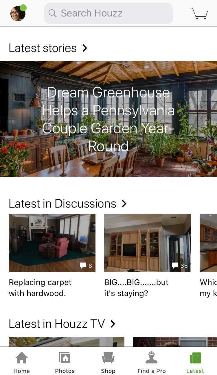
There’s a category menu along the bottom of the screen. None of these icons will take me to the discussion I started on Houzz. Alright, hmm, let me click on my photo. Since it’s my item maybe that’s the ticket!
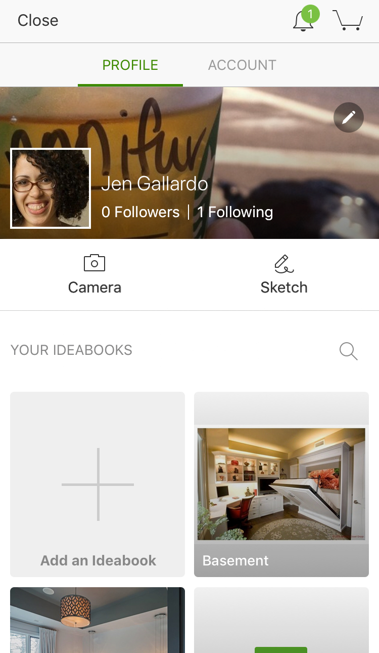
Warm but still no cigar. I see ideabooks I created and I see a means of creating a new one of those, but it’s not clear where I go to see other things I created. For shits and giggles, let’s click on “Account.”
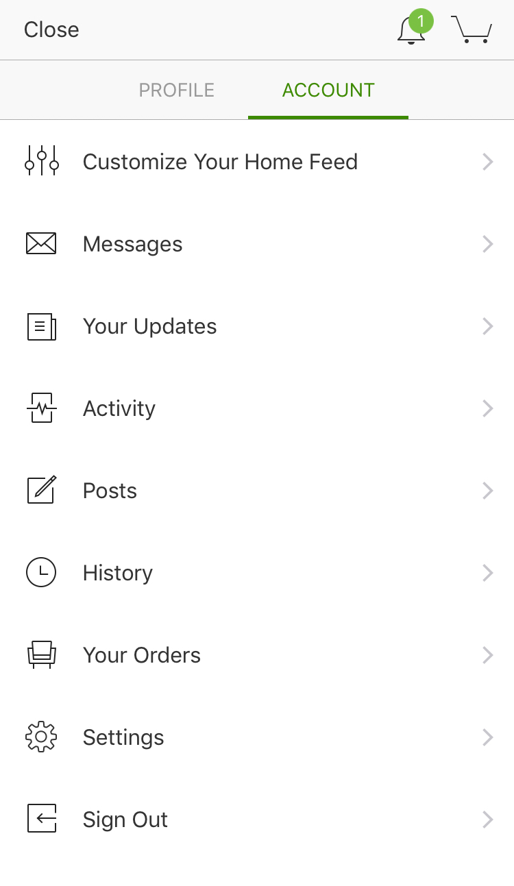
Ah ha! There’s the junk drawer. It’s literally a list of random stuff. And, at first glance, I see Activity, Posts and History — any one of these 3 could be what I’m looking for! And in fact any one of the 3 could be relevant as all 3 will show the discussions — or are they posts? This is a big pet peeve of mine. In one part of the app, it says “start a discussion” but then when your brain is looking for something called “discussion” the app instead uses posts. I’m ok with either word but from a user cognitive load perspective, if you are going to make me hunt for it then at least keep the naming consistent.
Editing the thing you created
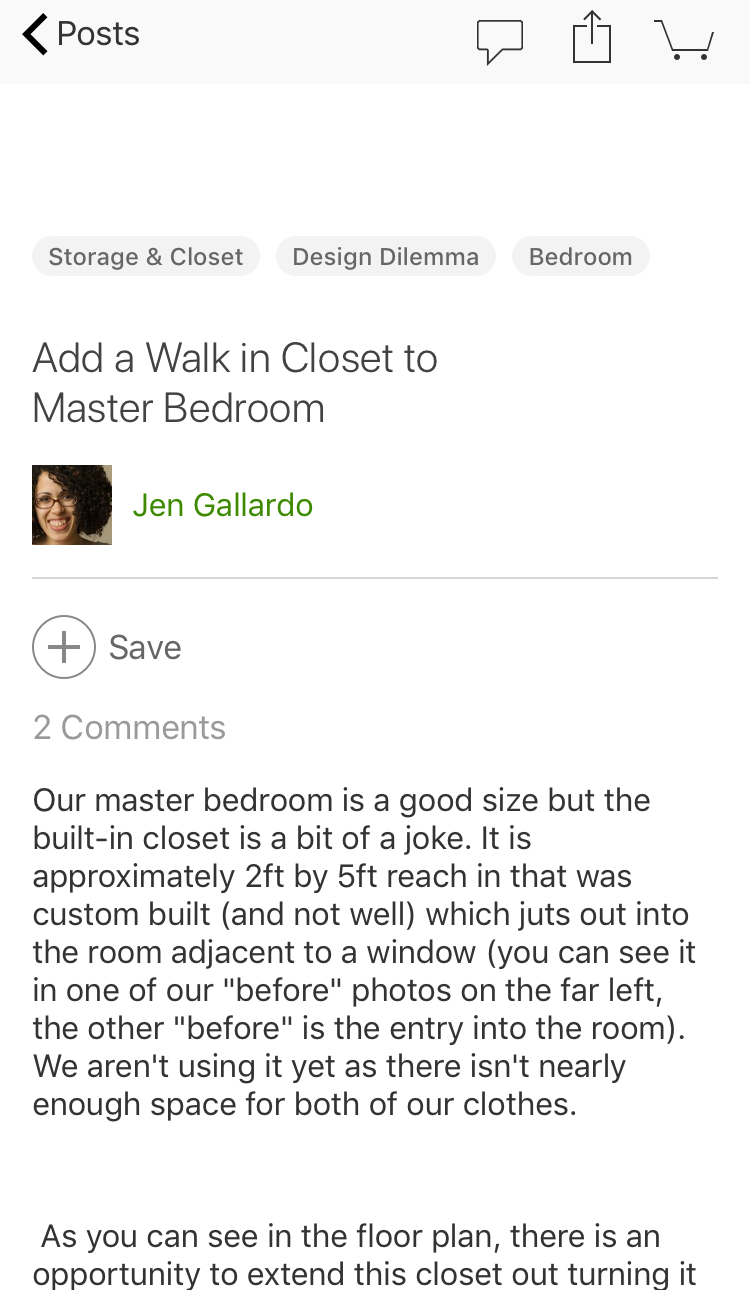
My other pet peeves is now on the post screen. On my iPad, I was able to edit. On the mobile, apparently you must get it right or else! The menu at the top right allows me to comment on it which makes sense in order to respond to current comments. Then there’s an option to share which is not bad considering how difficult it was to get back here. But then the last option is a goddamn shopping cart. Am I adding the discussion to my shopping cart? No. Am I looking at my shopping cart to then go back and edit my post as a result? No, because I can’t edit anyway. I understand the idea of wanting folks to get all the way through the acquisition funnel. I am the queen of cart abandonment. But this just doesn’t make sense, especially when it takes me to an empty cart as it does now. The save button probably makes far more sense up there versus the shopping cart.
Suggestions
It’s not clear to me what Houzz wants to focus on. There is a lot going on in this app and it feels a bit jumbled. Perhaps they had to graft on someone’s pet feature? Maybe they had some scope creep? Perhaps the product teams are siloed and lack a unifying vision? It just seems like there’s too much which leads to inconsistency.
Some of it is done really well like the Photos area that can very clearly tie the visual you are interested in with products that are actually available for purchase (something Pinterest seems to struggle with). But then there are things that seem really awkward, half baked and perhaps intentionally buried like discussions; and I totally get it. Does Houzz want to be Pinterest, Reddit, Stack Overflow and Angie’s List all at the same time? Of course not, so something’s got to give.