Yes, this is a story about luggage but it begins several years ago in Dublin, Ireland. Let me explain.
The River Liffy, Dublin (photo by Jen Gallardo)
A while ago, I purchased a really unique piece of luggage. It was damask-printed and, if you know me, you know I’ve never met a print I don’t like. It was a duffle bag on wheels and I was okay with that — until I flew Ryan Air.
Going through all the checkpoints from London to Dublin, nobody glanced at my luggage. It was big and yellow (and fancy printed!) but nobody really cared as the Ryan Air flight attendants were trying to simply get everyone settled in for the slingshot across the way to Ireland.
However, when flying from Dublin to Liverpool, I hit a snag — an overzealous employee who wanted to see if my bag could fit the sizer (i.e. the contraption they use to suss out if your bag exceeds their size limitation). She didn’t care that I had flown with it on the previous leg of my journey on their airline, she wanted to see it fit in the sizer.
I wrote this piece on Medium first about my work as a Product Manager:
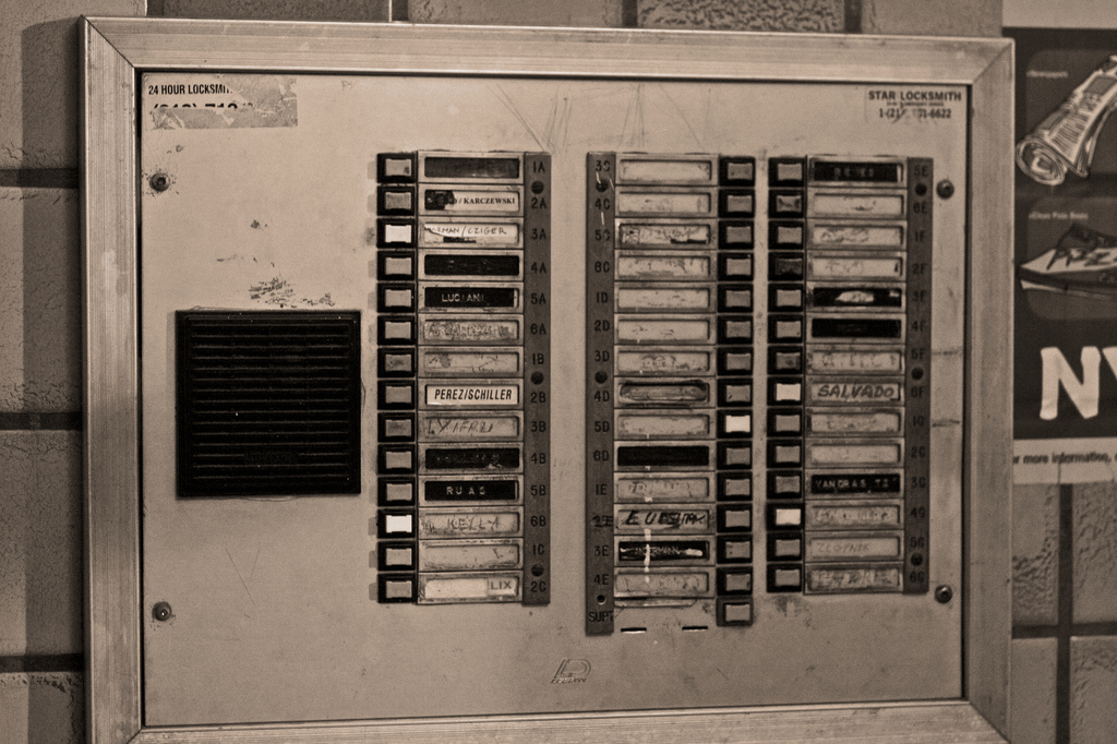
I work in a large room that’s offset from a larger and more public area. The room is locked, so that only people who work for my company can enter as long as they have an ID badge with the appropriate permissions assigned. There are two doors through which one can enter the room. These doors can be opened by anyone from the inside of the room, but you must first push a red button adjacent to the door.
I wrote this piece on Medium first about my work as a Product Manager:
Last week, colleague walked over to my desk to ask me about the product I just started working on. And by started to work on, I mean I inherited this product in part because there was some significant “clean-up” needed and rumor has it that I’m good with fixer-uppers. His question to me was, “How about we just start over?” In short, stating that he’d almost rather walk away from this dumpster-fire mess than somehow try to put out the embers and make something of the leftover half-burned pieces of fresh garbage. Well, this isn’t exactly what he meant but that’s probably how I felt when I heard the question and realized the hole I now needed to climb out of.
Lately, I’ve been into carrying smaller purses on the weekends. It forces me to think about the bare essentials and probably reduces strain on my shoulders that are accustomed to carrying a bag that can at worst accommodate a 13″ work laptop or at best carry around my 9″ iPad plus a number of other odds and ends (giant wallet, makeup bag, etc).
This is a big shift for me as, for a while, I was only buying bags that could fit my camera. Since my camera (Canon DSLR) takes up a lot of room, I’ve been seriously considering down-sizing and have rented other cameras over the last 6 months just to get an idea of what I might like to buy (or not). When Adorama Camera had their infamous Passover rental special (10 days more or less for the cost of a weekend), I decided to pick up a camera I had wanted to try the last time they had one of these sales — the Leica Q. Continue reading “Reviewing the Leica Q”
I use the Pocket app which I love. It allows me to hold on to interesting articles to read (or re-read) later on the subway (where I still often have little signal).
The gist of the article is that, when you feel stuck and you don’t think you are making progress, reflect on how far you’ve come in the last 10 years. I’ve been thinking a lot about my life trajectory, especially in the wake of this crazy election, but I never really thought of it this way.
The author makes a compelling argument against the constant anxiety around our forward-looking plans.
At least a few times a year, I’m prompted to think about work. We all go there most days a week but rarely give any thought to whether it still makes sense to be there or if change is needed.
I receive a lot of email newsletters that are focused on career ladies, like myself, and they typically follow the same tired career tropes:
Find what you love and you’ll never “work” a day in your life!
Take a risk and do what you love!
The reason I call these tired is because we all know that doing what you want, in any given moment, is often more fulfilling than doing what you think you should be doing. For example, sleeping in on the weekend is way more fulfilling than spending those hours doing laundry or cleaning. This is common sense and not worth repeating.
If you know me, you know that I’m mildly obsessed with nail polish. I have a large box in my dresser containing various colors and styles – as well as nail art tools. Selecting a polish to wear can sometimes be really difficult (seriously, it’s like choosing among children!) so I’ll ask my dear husband to weigh in. Most recently, he selected one of my all-time favorite polishes, Essie’s Chinchilly.
Chances are you are not like me and know the names of all your favorite nail polishes. However, Chinchilly is a legend so you’ve probably seen it without knowing you were looking for it. I’ve had women in the elevator stop me and ask me if the color they are admiring on my fingers is Chinchilly. It’s a seriously “greige” color; a bit of neutral and grey and even lavender depending on the light.
Essie Chinchilly on a chilly day
When I decided to begin painting my nails with my bottle of Chinchilly, I discovered a dire situation — the bottle was past its prime and beyond repair. I have some nail polishes that get a bit gloopy (really thick and barely manageable because they are probably actually expired…) but they are still somewhat useable so I keep them around. But this time, most of the bottle had been used and what was left over was the nail polish equivalent of backwash.
I considered instantly re-buying it on Amazon but I held off because I thought that might be a bit excessive (and dear husband would’ve surely made fun of me!). Instead I bought a new bottle later at Rite-Aid. But that’s not the point. The point is I thought about the experience of re-buying something that you absolutely love. Continue reading “Luxury User Experiences: Chanel”
The other day, my husband decided to share a trailer for the latest Gran Turismo game that was unveiled for the Playstation console at the latest E3 events. I remember playing Gran Turismo games with my little brother way back when on the original first Playstation! I also really enjoy, now as an adult with a driver’s license, having the opportunity to drive high performance cars from time to time; though, most of the time, I’m rolling around in a compact car with good fuel economy thanks to Zipcar. All that said, we watched the trailer together and were in awe of the beautiful graphics that made sleek sports cars look even sleeker.
However, while the game graphics look fantastic, I noticed a small omission in the trailer I watched. Let me explain.
At about 45 seconds into the video, multiple world flags appear circling the globe with some text overlayed that says “Driving is for Everyone.” I thought that was cute and chuckled softly to myself. Yes, driving should be for everyone because, personally, I find it fun and convenient for getting across this giant country we live in.
By about 2 and a half minutes in, they start presenting images about live tournaments they’ll be running regularly. I think to myself, “How the hell are they going to manage that?” but I’m sure they’ve figured out some way to automate it so that people can play in these tournaments online and it works fairly seamlessly.
At 3 minutes in, the screen now reads “Open to all ages, anyone can enjoy” but all the faces I see feverishly playing the new game are men. Eight seconds later and I think I’ve spotted ONE woman deep in the background at this tournament event they are showing footage from. Another six seconds go by and I see a crowd of people clapping for the game, not sure if they are fans or journalists but it is fairly clear that they are also ALL men. By 3 minutes and 38 seconds into the video, it is still a sausage fest with a group of male victors celebrating.
Seriously, how great is it to be a television fan? What used to be relegated to HBO and Showtime (and sometimes Starz) has now been extended to all methods of consumption. There are great long-running shows that first aired on cable like the dramatic Mad Men and the often ridiculous It’s Always Sunny in Philadelphia. Then there have been amazing shows on Netflix like the addictive House of Cards and the adorable Unbreakable Kimmy Schmidt. And don’t get me started on all the programming on network television! Shows like Flash and New Girl come to mind immediately, but there are many others.
And, on top of all the great programming that has been developed, we have more ways to watch than ever. Netflix and chill is a thing because pretty much everyone has Netflix. And since a lot of people have Amazon Prime membership, Amazon Prime Video is also a thing (it doesn’t hurt that they have the entire HBO back catalog — now I can watch Six Feet Under and The Wire!). Finally, there’s also Hulu which amazingly has carved out a niche for itself with original series content as well.
With so much great stuff to watch, it’s often hard to find the time. What can make it even harder is if you are part of a couple that co-watches. My husband and I typically try to watch shows together because we enjoy talking about them when we aren’t watching them, but also because it’s another way to spend time together. And you know that co-watching is a real cultural phenomenon when even the New York Times devoted some space to it, touching on how it impacts real relationships.
And, while I fully acknowledge this is a total first-world problem, co-watching can be really challenging! My husband, Anthony, and I want to watch things together but sometimes I’m at Muay Thai class late or he’s off covering a soccer game. The reality is that because we are two fiercely independent people, our schedules don’t always line up. We don’t always watch the same things, but when we do, it can be something that we literally need to schedule on our calendars to ensure we can watch together.
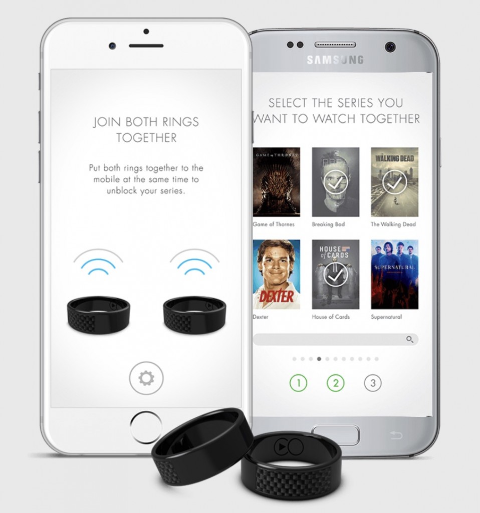
But, this can put a strain on a relationship and cause a partner to stray — and watch TV shows without their partner (instead of patiently waiting for a co-watching opportunity). I’ve often said that Anthony has “cheated on me” with a particular program that we wanted to co-watch. Like most things in this day and age, thankfully, there’s an app for that!
Right now the temperature is starting to warm up in New York. However, it’s inevitable: winter will be here again before we know it.
#winteriscoming
And every winter, I’m freezing to death because at some point in time I wore the wrong shoes. Like that time I was going to Philadelphia and needed a headphone splitter so my husband and I could co-watch a movie on the bus ride down. I spent the better part of an hour searching for one while the snow came down around me. All I found was that my boots had sprung a leak and that apparently the only place to buy dry socks in TriBeCa is at the Equinox where you will spend too much money for them (do rich people not need socks?!).